Dashboard
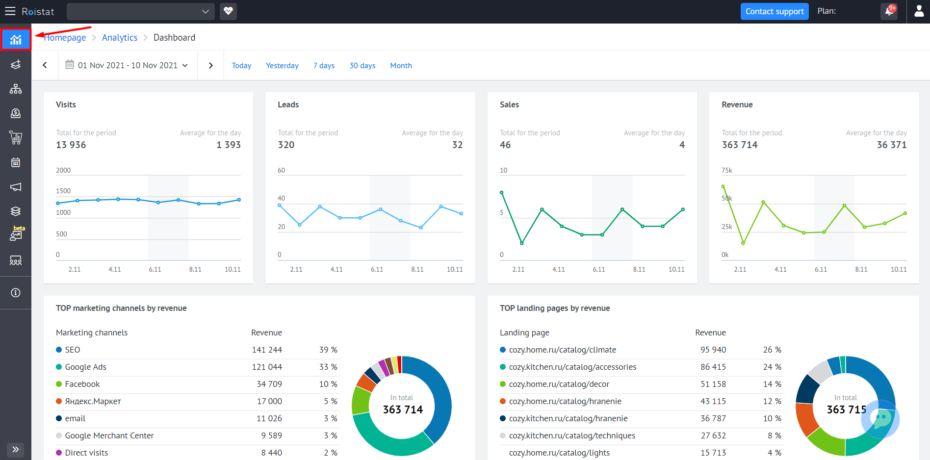
The Analytics Dashboard contains statistics on the main business metrics of the project as simple widgets. This can be handy if you don't want to create a separate report in Analytics or compare numbers separately. To open the Dashboard, go to the Analytics section and select the Dashboard tab on the left panel:
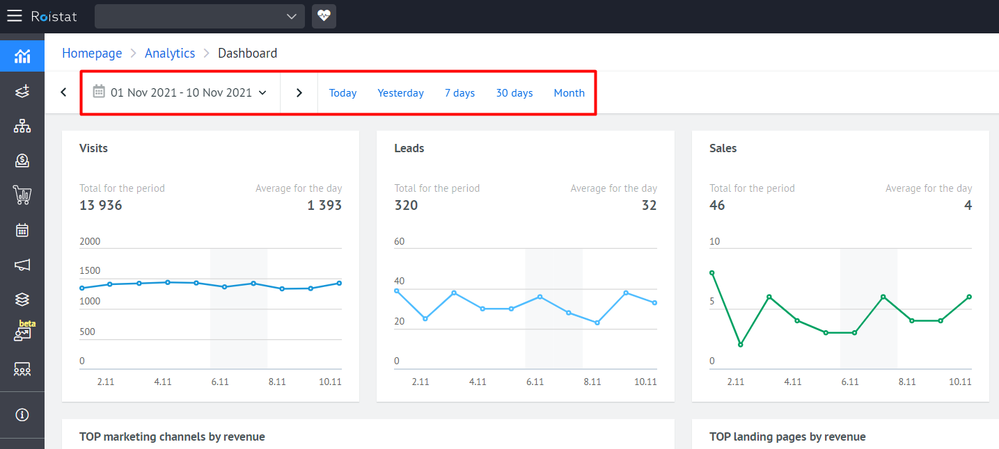
Just select the period for which you want to view statistics, and the data will be updated automatically.
Visits, Leads, Sales, Revenue
General statistics on visits, leads, sales and revenue for the project can be viewed in four corresponding widgets:
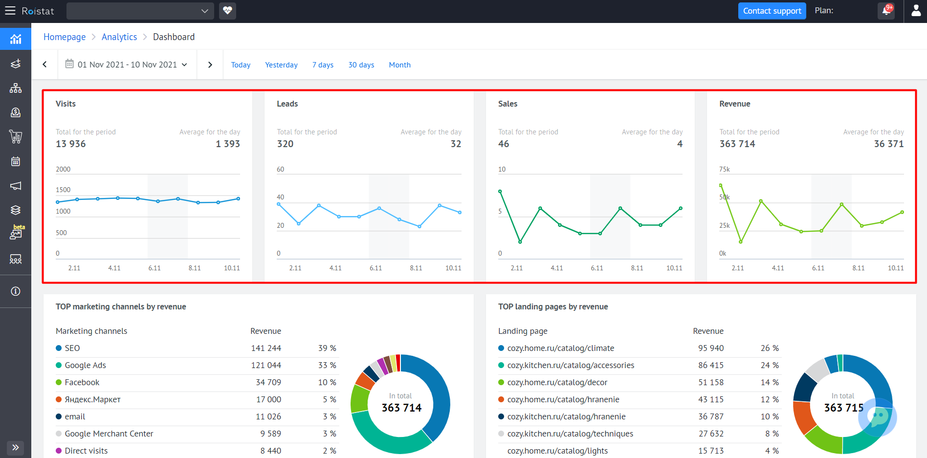
For each metric, the following is displayed:
- Value for the current day;
- Value for the last 30 days;
- Average value per day for the last 30 days.
The graph on the widget displays how the metric has changed over the past 30 days. Hover over the graph area and you will see the metric value for the selected date.
Please note:
Roistat tracks the region of the visit by the client's IP address. If the region is not defined by IP, the region of the visit will be an unknown value.
Top Marketing Channels, Landing Pages, and Cities
For marketing channels, landing pages and cities, we have selected 3 separate widgets, where we show the top 6. For channels and landing pages - top 6 by revenue, for cities - by visits.
For advertising channels, landing pages and cities, there are 3 separate widgets where the best results are displayed. For channels and landing pages, the ranking is based on revenue. For cities, the ranking is based on visits.
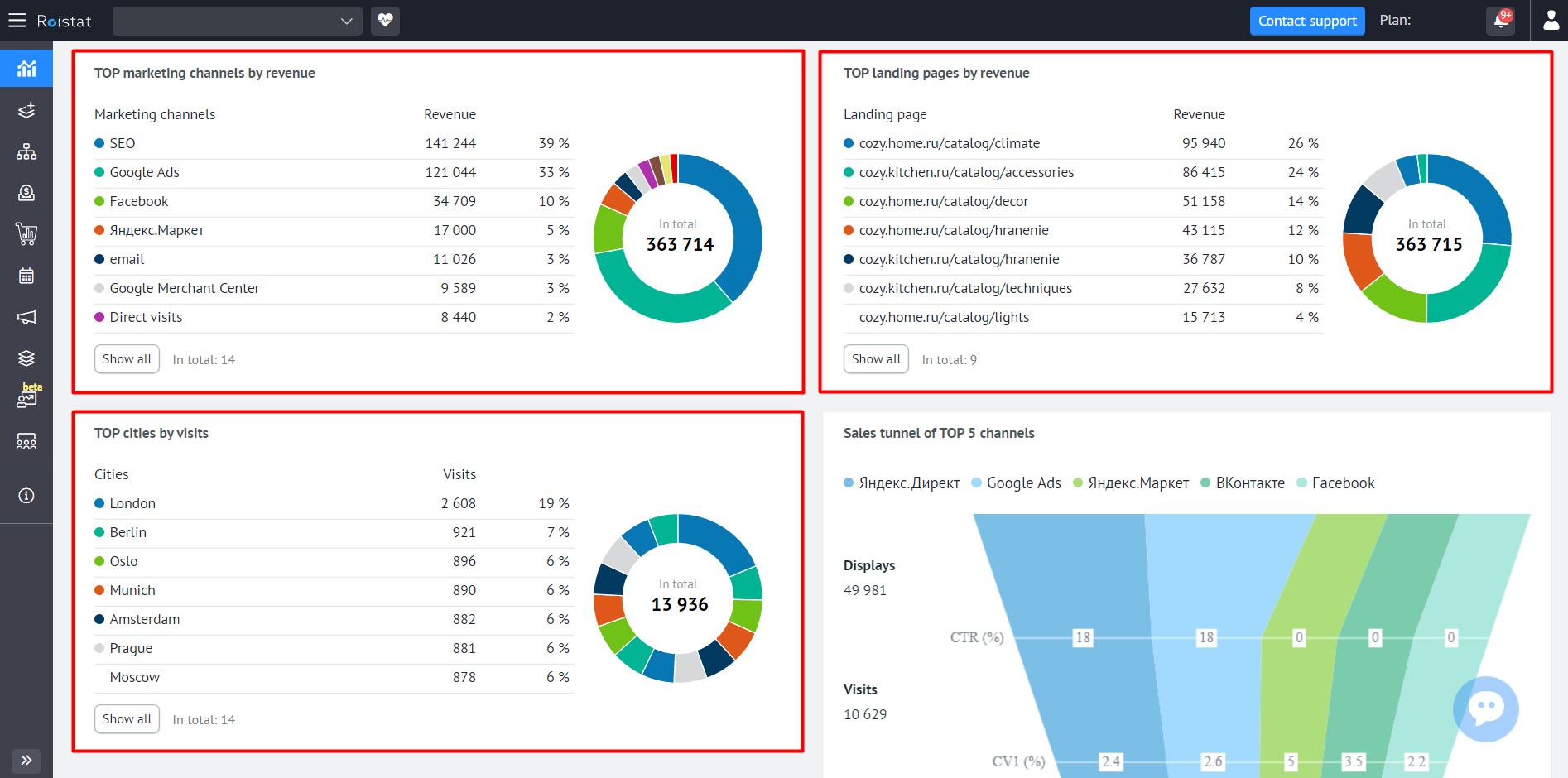
For each channel, city and landing page, the value of the compared metric and the percentage of the total number/volume are displayed.
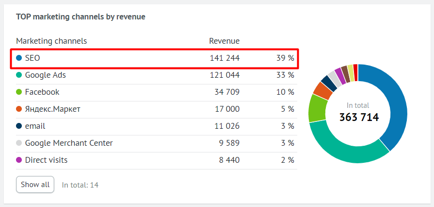
For example, the most popular channel for the last 3 months is SEO, and it brought 39% of the total revenue. This is how information on the SEO channel will look like in the widget:
Click Show all if you want to see statistics for all channels, landing pages, or cities.
On the pie chart, you can visually assess which of the channels, landing pages, or cities turned out to be the most popular. Here, each item is highlighted in a separate color, and when hovering over a sector, its name and metric value pop up.
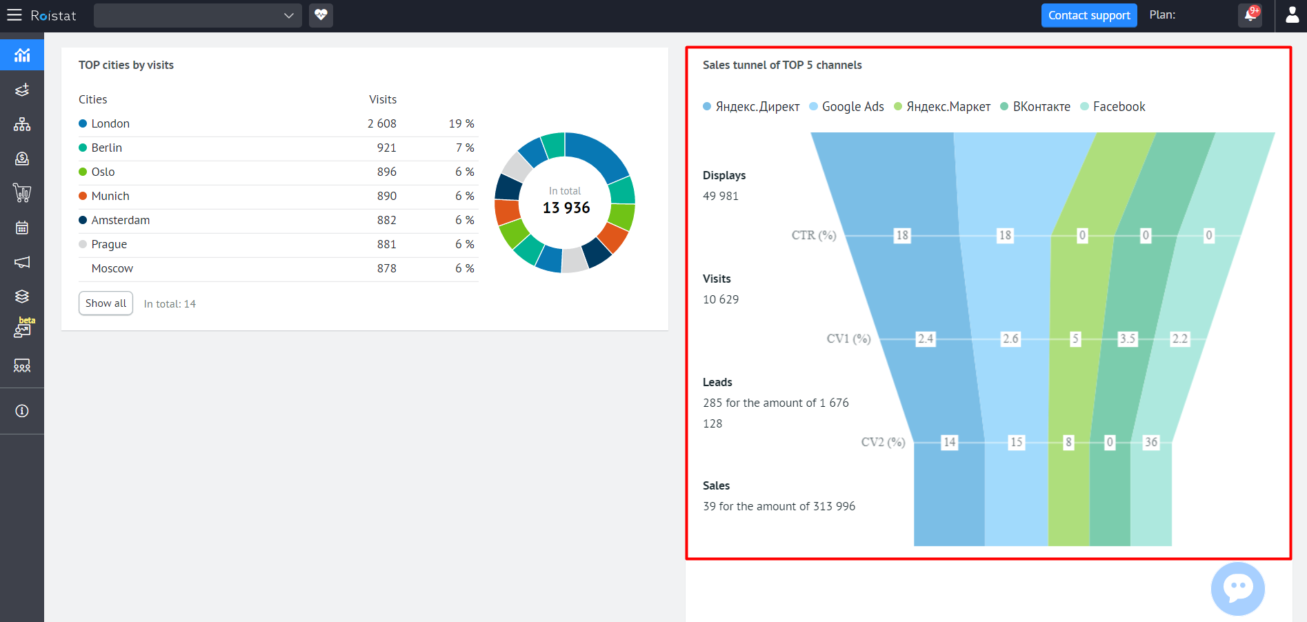
Sales Tunnel
The widget shows the main metrics for the five advertising channels that generated the most leads during the selected period.
There are four main stages in the sales tunnel: Displays, Visits, Leads, and Sales. At each stage, statistics are displayed for the corresponding metrics:
- Displays
- Visits
- Leads
- Sales
- Revenue
- CTR
- Leads Conversion
- Sales Conversion