Custom Dashboard
In the Analytics section on the Custom dashboard tab, you can create and customize reports on any project business metrics in the form of widgets. All widgets are located in one place, and you can monitor several business metrics at once without having to switch between multiple reports in Analytics.
Ready-Made Widgets
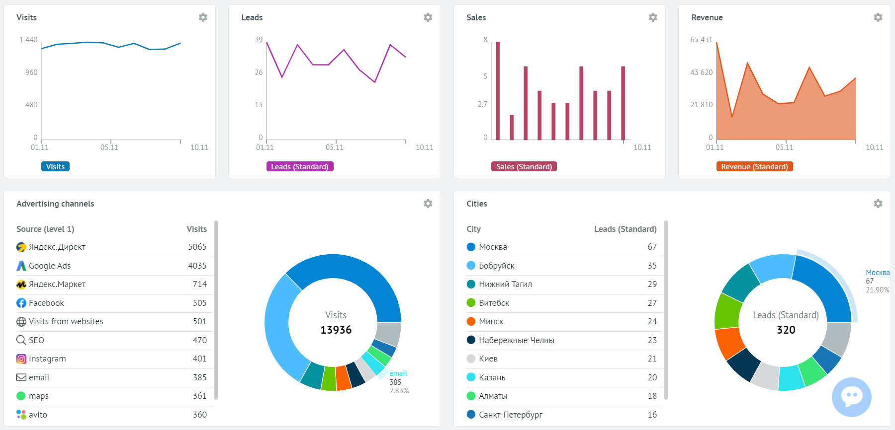
Roistat has ready-made widgets for the main business metrics in the project: Visits, Leads, Sales, Revenue, Advertising channels, etc.
You can open the widget settings to see how the specified options affect the content of the widget.
How to Create a Widget
-
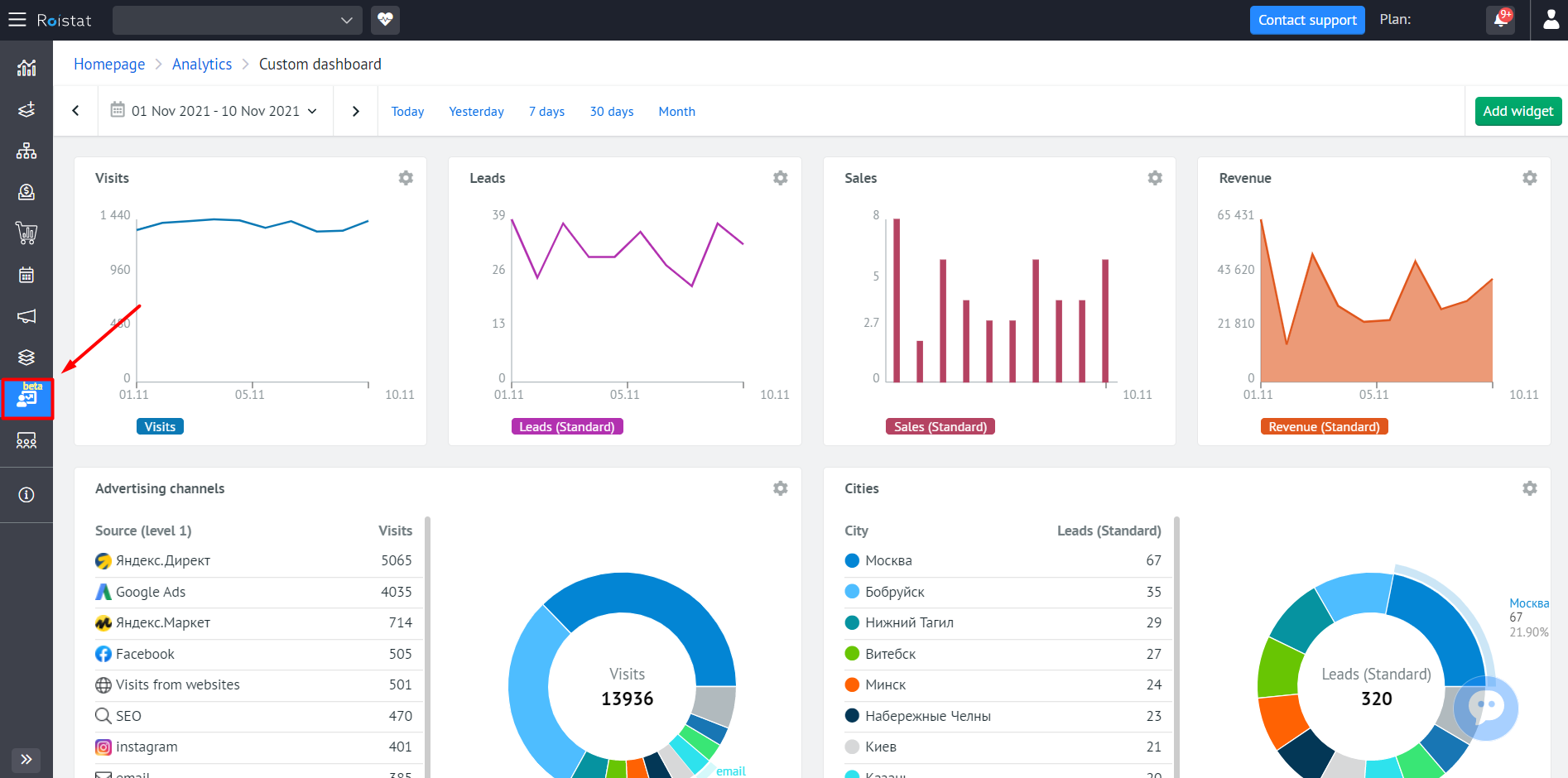
Open the Analytics section and go to the Custom dashboard tab:
-
At the top of the page, select the period for which reports will be generated:
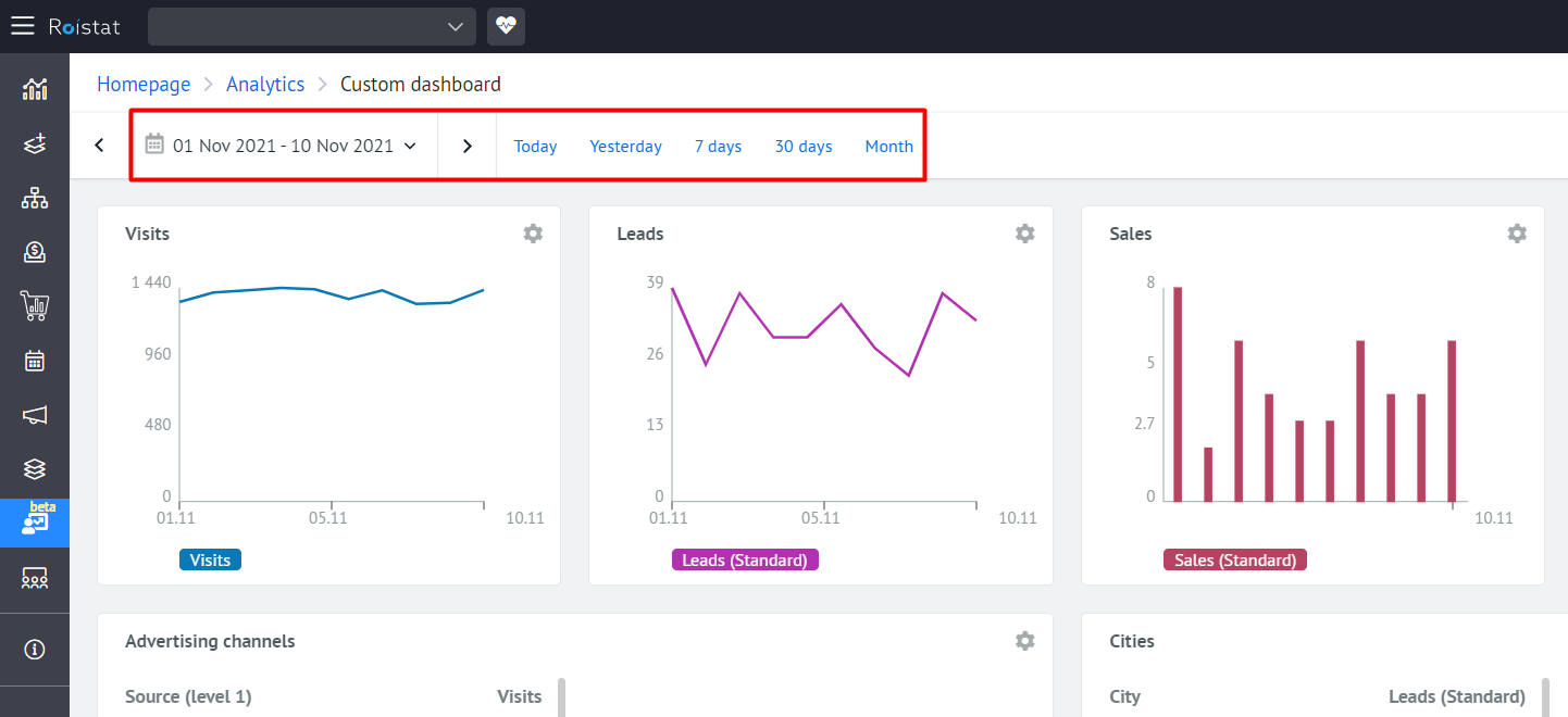
Please note:
If the Month period is selected, the report will display data from the beginning of the current calendar month.
-
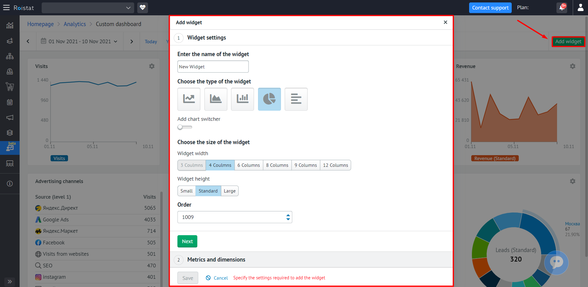
In the upper right corner of the page, click the Add widget button. The Add widget window will open:
-
In the Widget settings section, specify the following parameters:
- Enter a name for the widget.
- Select the widget type by clicking on one of the icons: Line chart, Area chart, Bar chart, Pie chart or Horizontal bar chart.
- Enable the Add chart switcher option to be able to switch between widget types using the buttons on the widget. If you selected Line chart, Area chart, or Bar chart in the previous step, you can switch between these types. If you selected Pie chart or Horizontal bar chart, you can switch between them.
- Select the width and height of the widget.
-
In the Order field, specify the number of the new widget in the list of widgets. By default, each new widget is added at the end of the list.
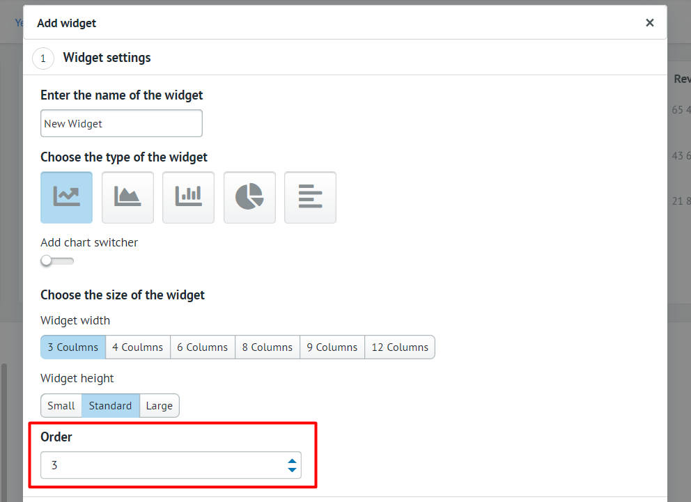
By default, a new widget is created using the following formula:
maximum number of widgets in the list + 1. For example, if you have 4 widgets configured, the new widget will be the fifth one, and the Order field will have the value 5. However, you can make the new widget third in the list by entering 3 in the Order field. To make the widget second in the list, enter 2 in the Order field, and so on. -
Click Next.
-
In the Metrics and dimensions section, click the Add a metric button and select a metric from the drop-down list. For the Line chart, Area chart, or Bar chart widget types, you can add up to five metrics. For the Pie chart or Horizontal bar chart widget types, you can add one metric.
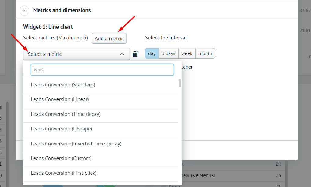
The following conversion metrics are not available for the Pie chart and Horizontal bar chart widget types: Leads Conversion, Canceled Leads, Sales, Absolute Conversion. The reason is that conversion analysis is not possible in these widget types.
-
If you selected the Line chart, Area chart, or Bar chart widget type, specify the interval. The report will display metric values at the specified interval within the selected time period for which the report is generated.
For example, for the period from July 10 to August 10 and the Day interval, the report will display metric values for July 10, July 11, etc. for each day up to and including August 10.
-
If you selected the Pie chart or Horizontal bar chart widget type, select the dimension and set the number of dimension values. A dimension is a parameter for which data is shown.
For example, if you select the Visits metric and the Source dimension, and then specify 5 dimensions, the report will show the number of visits for each of the five sources.
If your project has less than five sources, the analytics will be displayed for the available sources.
-
Click Save.
The new widget will be displayed on the page after the ready-made widgets or those that were created earlier.